Manner
Designing an end-to-end app that leverages information architecture to help non-native workers find the solutions they need to navigate Japanese business culture.
BACKGROUND
As a non-native Japanese speaker who works with Japanese partners regularly, I've found myself frantically Googling tips on Japanese business etiquette on numerous occasions. It can be stressful to be unsure of what to do in social situations at work. My mission with this project is to create a reliable one-stop resource for non-native workers navigating Japanese etiquette in the workplace.
ROLE
UX Research, UI Design, Prototyping, Usability Testing
TOOLS
Figma, Illustrator
TIMELINE
4 weeks, 80 hours
PROBLEM
How might we help non-native workers confidently navigate business etiquette in Japan?
SOLUTION
An app that serves as a single source of truth, structured to allow users to find exactly what they need.
As it stands, resources to learn about Japanese business etiquette are limited to online articles and videos covering specific topics. There is no easily accessible and comprehensive resource for information about the topic.

CHALLENGES
Japanese etiquette covers a web of related information, and my solution needs to account for this in its information architecture.
Like any social interaction, Japanese business manners are incredibly nuanced. There are formalities where you might not expect, like when choosing seats in a taxi, exchanging business cards, or riding an elevator. These niche manners had me thinking about discoverability from the early design stages. I wanted to ensure that my solution enabled users to find the information they were looking for and discover new rules that they may be unaware existed.
RESEARCH
Confirming that an app solution will add value to the problem space.
I began my research by identifying my assumptions going into the project. While my background working with Japanese business partners gave me the first-hand experience to guide my research questions, it was also essential to ensure that my past experience did not create biases in my process.
I hypothesized that workers want to have an easy-to-access source about business etiquette. Thus, my research began with looking at existing business etiquette resources for non-native workers. I was quick to confirm that there is a wealth of content on the topic in short-form articles and videos, but no comprehensive English resources for business manners.
This brought me to question whether a solution was necessary as the market I had identified was clearly untapped. Was I assuming an irrelevant need? Diving deeper into some market statistics validated the existence of a disconnect between how Japan is perceived as a work destination versus the actual working conditions for expats.
The stats above are a clear indicator that the existing work conditions for expats in Japan come with significant barriers.
Workers site cultural expectations as a reason for conducting online research on business manners.
In search of further insights into how non-native workers learn about business etiquette. I turned to 1-on-1 interviews with five people with experience interfacing with Japanese partners for work.
My interviewees were selected based on a provisional persona I created using findings from my market research. I developed two provisional personas for the product: the more casual business traveler, and the language proficient worker who is new to business culture. I chose to proceed with interviewing the language proficient workers as I expected their learning needs to be more complex, and as a result, also covering the needs of the more casual business person.
After conducting my interviews, I used an empathy map to synthesize my observations. Through this process, I was able to identify key insights and user needs.
Based on my findings, it was clear that proper etiquette is an essential facet of conducting business with Japanese people. There is also a need for information about specific situations and personal circumstances. And while users find these pieces of information to be essential, they are often left to research on their own due to cultural expectations of maintaining the flow of business.
Utilizing results from my interviews and market research, I created a persona who served as a proxy to the end-user.
BRAINSTORMING & PRODUCT ROADMAP
Brainstorming and defining an MVP that aligns with user needs.
In order to ask the right questions for how the product might best serve the user, I turned to how might we questions based on the user needs I unveiled in my interview findings.
Guided by my HMW questions, I brainstormed using the mind mapping technique to generate as many solutions as possible.
Time was a major constraint with this project so it was necessary to prioritize the potential features to build. I did this using a product roadmap, narrowing the scope of my design focus to an index of rules, search bar, and login and onboarding questionnaire.
INFORMATION ARCHITECTURE
Given the interconnected nature of Japanese etiquette rules, well-structured information architecture was essential to the success of the app.
I’ve structured the app so information can be found via one of two ways.
Situation Pages: Guides that walk through a business interaction or process from beginning to end. These pages allow users who don't know where to start to cover the essential information for key business situations.
Topic Pages: Topic-specific pages that serve users looking for specific information.
TASK FLOW
Establishing a clear flow to necessary information — from onboarding, situation walkthroughs, and the index.
My project roadmap defined the features I would build for my MVP product. Based on the priority features I decided to build out task flows for; the sign-up and onboarding process, finding information from the situations on the dashboard and finding information using the index.
LOW AND MID FIDELITY WIREFRAME SKETCHES
Modular cards for multiple entry points to overlapping information.
I experimented with multiple iterations of the index and onboarding questionnaire with quick sketches on paper. The sketches below are for the screens that would change according to my task flows. Since I knew parts of the articles featured under both situations and index terms would overlap, I created expanding sections to nest detailed information.
After identifying the low fidelity designs that best served my user’s needs I moved on to design my screens in mid-fidelity to use for testing. The intension behind this choice was to focus on usability without the variables of visual design. In creating an app from scratch, I wanted to keep myself comfortable with the prospect of changes to the design.
USABILITY TESTS
Testing revealed users experienced difficulty accessing the index section.
Using Zoom, I conducted seven moderated remote usability tests to see if users were able to use the new features as intended. For these tests, each user was asked to complete tasks using a prototype made up of my mid-fidelity screens. The tasks were designed to follow the task flows I had created; walking through the onboarding process, finding information on a situation page, and finding information using the index.
Users had no trouble working through the onboarding process and finding information via the situations section of the dashboard. However, all seven of my participants struggled with the task of finding information using the index. The reason for this was that the many topics covered in the dashboard section had participants assuming that all the solutions they needed were available on the main dashboard page.
BRANDING
Simple branding that feels professional, but also positions Manner as a user-friendly app.
As for the brand logo, I made a nod to the Japanese “beginner’s mark” and an open book. In Japan, a downward pointing arrowhead symbol is used to signify beginner status, most commonly used in driving.
The simple color palette featuring a bright highlighter yellow was inspired by a traditional reference book that is well-loved and annotated.
Building off of the core function of the Manner app — an easily accessible reference for Japanese business etiquette — I looked to simple branding that was professional and positioned Manner as a user-friendly app.
HIGH FIDELITY WIREFRAMES
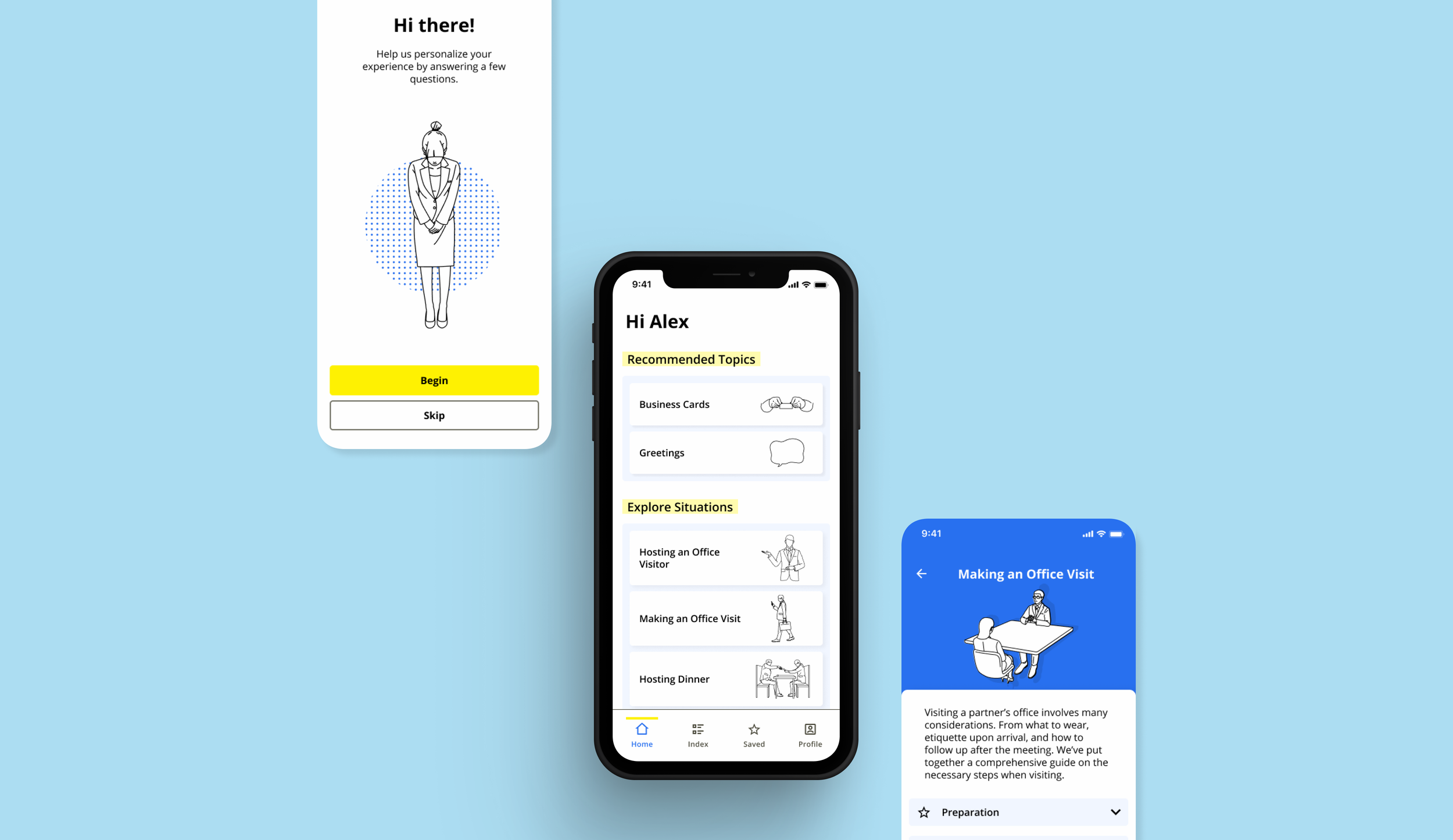
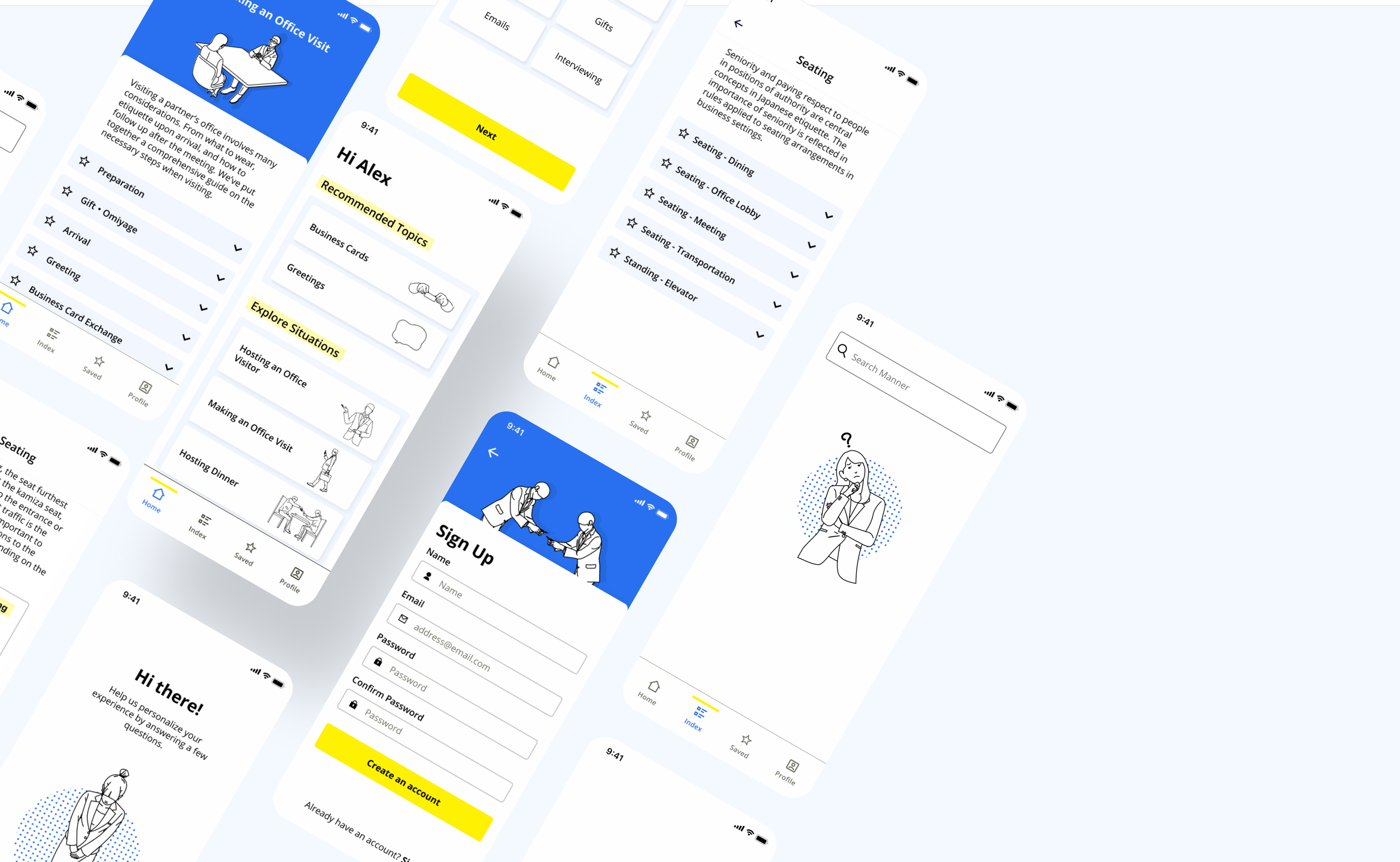
After finalizing my brand direction, I applied color, typography, and imagery to my mid-fidelity designs.
Creating a sense of visual hierarchy was a challenge with my simple color selections. Since yellow is not a color that is legible when used alone for text. This situation inspired me to revisit my core brand ethos of providing clear reference material. After some rumination, I came to the idea of adding "highlights" to the section headers. Working through this process made it very clear to me how important it is to have central pillars to each aspect of product design
Customized Experience
After the user completes the sign-up process, an onboarding questionnaire helps users get started with the app by identifying relevant topics based on the user’s field of work, Japanese proficiency, and learning preferences.
Information Architecture that Promotes Discovery
In order to address the issue of users requiring some base understanding of business etiquette to know where to start, I organized information on cards that are nestled in either topic pages or situation pages.
Modular Cards
Key situations are presented on the main homepage for all users to provide a comprehensive understanding of the expectations in common business situations. These situations are on the main homepage to promote organic discovery of interconnected topics.
Topics take a deeper dive into specific subject categories so they are listed under the index.
Some Final Thoughts
TAKEAWAYS
Working in a familiar space allowed me to tap into a wealth of ideas from the perspective of a potential user. This made validating my assumptions even more important than ever. I found myself getting attracted to particular ideas based on my excitement as a potential user. When I found myself in this situation, I made it a point to remind myself to take a step back identify ideas that aligned with my research vs ideas I just personally liked.
Testing virtually via computers for a mobile app has its drawbacks. Although it is convenient to be able to conduct tests virtually, it was immediately clear to me that it is not a true test of the mobile experience. There were some hiccups in my testing due to the tools used. For example, one user tried to type on their keyboard when making a search.
NEXT STEPS
Although this is was an exploratory project, if I were to develop this project further I would start working with a developer to start building the app and build out additional features noted below.
Saved section. If I had more time, I would build out the “saved” area of the app where users would be able to create their own custom situations for reference. Users would do this by saving the expanding topics that are relevant to their needs.
Profile section. Build a profile section, so users are able to access and retake the onboarding questionnaire.


