TSELOGS
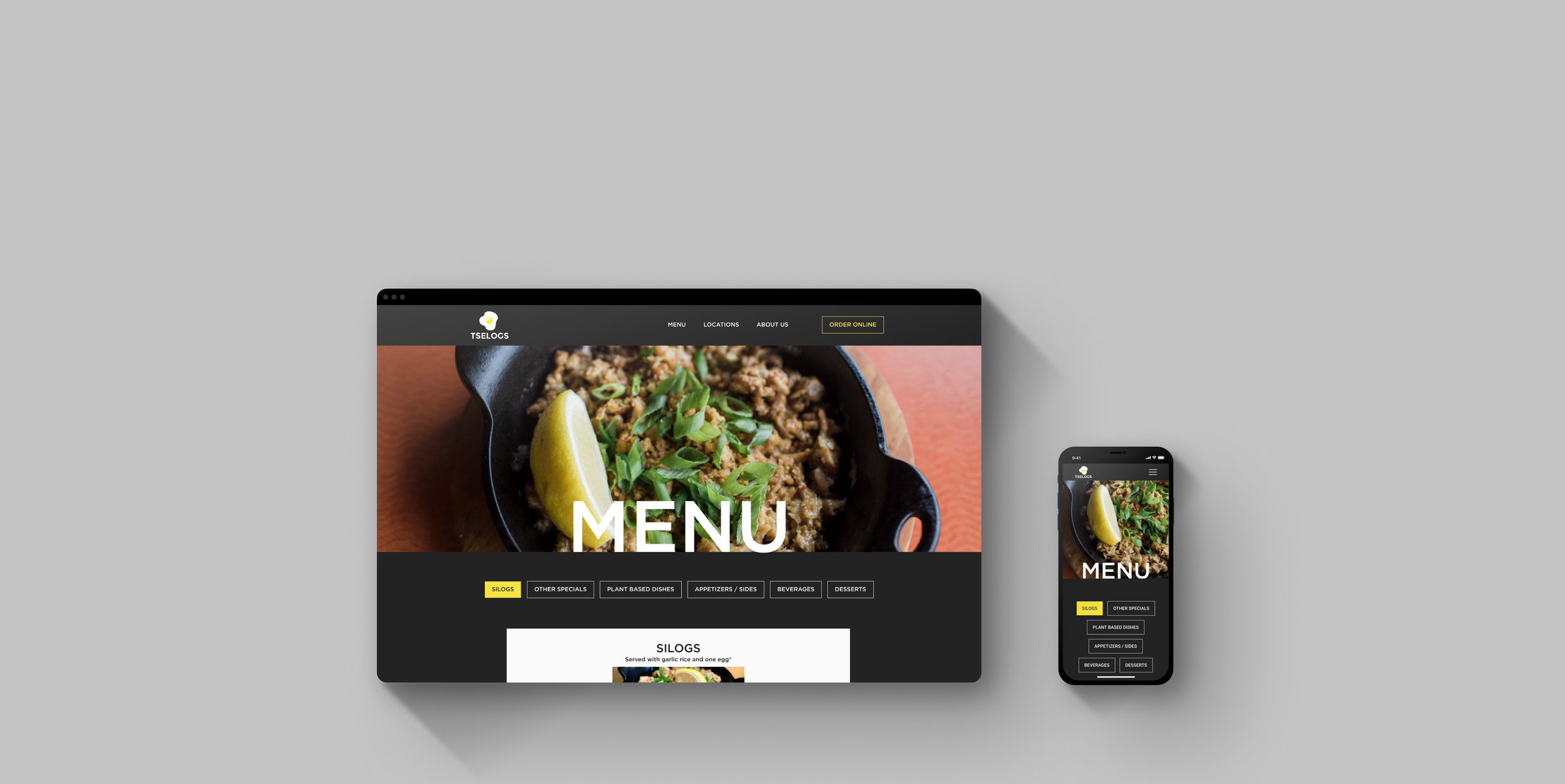
A responsive website design for a local Bay Area Filipino restaurant.
BACKGROUND
Tselogs is a casual SF Bay Area Filipino restaurant with three locations, two of which are currently temporarily closed due to the pandemic.
Each Tselogs restaurant has its unique vibe ranging from a hole-in-the-wall spot in downtown SF to a more spacious location in the trendy Mission district. I tasked myself with redesigning the website, covering the essential information visitors might need, and establishing a brand voice that is more reflective of the in-store dining experience.
*Note this is a speculative project. This project was completed as a part of DesignLab’s UX Academy Program. I am not affiliated with Tselogs.
ROLE
UX/UI Designer, Branding
TOOLS
Figma, Adobe Illustrator, Photoshop
TIMELINE
4 weeks, 80 hours
PROBLEM
The existing Tselogs website is not responsive and the design does not reflect the in-store dining experience.
SOLUTION
A responsive website that focuses on the information customers need when browsing to have a meal at Tselogs.
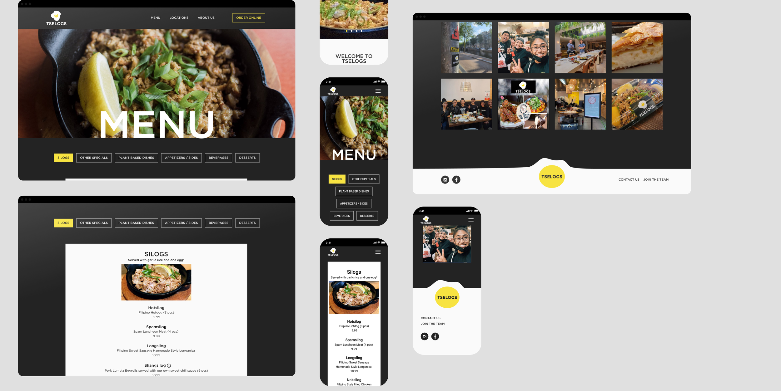
To allow for a more seamless experience across devices, I revamped the Tselogs website with a responsive design. I reimagined the website to reflect the modern and bold decor that sets the Tselogs in-store experience apart from other local Filipino restaurants. Layout and content featured were decided based on research done to identify the information customers look for when deciding on a place to dine in.
SECONDARY RESEARCG
There is a huge market for Filipino food in the Bay Area. The San Francisco Bay Area is the home to the densest concentration of Filipino Americans in the US. To date, Filipino cuisine has been largely underrepresented in the US in proportion to its Filipino-American population, however, food experts predict that Filipino food has the potential to be the next big ethnic food.
Through competitive research, I identified that Tselogs is the largest locally owned Filipino restaurant business with a total of three locations. I saw this as a selling point for the business as a non-fast food option that provides a consistent dining experience across multiple locations.
Competitive pricing was a common thread among Filipino restaurants including Tselogs. On the other hand, the other restaurants with competitive pricing tend to have simple no-frills experiences. Each Tselogs location greets customers with contemporary yet cozy-looking decor, a key defining factor that I want to reflect on the website design.
PRIMARY RESEARCH
An opportunity to embody the Tselogs dine-in experience in its virtual presence.
While my key objective with this project was to reimagine the Tselogs website with a responsive design, I also saw this as an opportunity to embody the Tselogs dine-in experience in its virtual presence. I interviewed five customers to understand the dine-in experience and identify customers' needs when visiting a restaurant's website.
To synthesize my interview observations, I organized my raw information into an empathy map to identify patterns in the interviewee's responses.
To synthesize my intervew observations, I organized my raw information into an empathy map to identify patterns in the interviewee's responses.
KEY TAKEAWAYS
Customers see a restaurant's website as a source of truth
Five out of five interviewees stated that they visit restaurant websites to check the menu. Although there are many resources available to customers when seeking information about a particular business, users need a reliable and official source of information regarding menu options.
Need to provide information essential to planning a visit
All five of my interviewees expressed that their first visit to Tselogs spurred from a spontaneous decision. This observation brought to light the customer's need for information to plan an impromptu visit.
Authenticity informs customer action
Four out of five interview participants noted their desire for authentic food as a key motivator in their discovery of Tselogs, suggesting that customers need to confirm authenticity when deciding to visit Tselogs.
USER PERSONA
In order to stay true to the human-centered process, I created Marian, a realistic representation of a Tselogs customer that addresses the customer needs when visiting a restaurant website.
SITEMAP
When defining the website structure, I made it a point to organize information prioritizing the user and restaurant's needs. Customers seek information about the menu and business needed to decide whether to visit a business. On the other hand, Tselogs aims to convert these curious website visitors into customers.
TASK FLOWS
I narrowed down my persona Marian’s, potential interactions with the site into three key tasks that embody her user needs. The task flow allowed me to identify the exact pages and actions I needed to design.
USER FLOWS
Then, I moved on to the more comprehensive user flow that covers every possible action that a user could take on the Tselogs site. The user flow shows an added level of the individual decisions that Marian would make on each page.
LOW FIDELITY DESIGNS
With a site map, task flow, and user flow in hand, I had the framework to start sketching low-fidelity wireframes for my key task flows. I used pen and paper to quickly sketch out as many ideas as possible.
While sketching, I kept some key insights from my interviews in mind to inform my design decisions. Interview participants noted their main reason for visiting a restaurant's website was to check the menu. I wanted to ensure the menu was immediately accessible, so I listed it as the first item on the navigation menu.
RESPONSIVE MID-FIDELITY WIREFRAMES
Reviewing my quick homepage sketches, I chose the layout that followed Marian’s needs the most. I then digitized my sketches into mid-fidelity wireframes to show more detail — including accurate spacing, headlines, and buttons.
I first tackled the desktop screens before translating the same designs to tablet and mobile using a bootstrap grid system to ensure a cohesive experience across devices.
USABILITY TESTING
At this point, I created a mid-fidelity prototype on Figma to conduct usability tests. This allowed me to test my design before investing time into high-fidelity prototyping. The overall goal of the usability test was to see if the prototype I created addressed the user goals, needs, motivations, and frustrations.
OBJECTIVES
To observe if users run into any difficulty finding restaurant information (hours, address)
To identify any areas of confusion that the users have when completing the task.
Usability tests were performed via Zoom using the think-out-loud method. Five participants between the ages of twenty-four and forty years old were tasked to walk through several tasks while sharing their thoughts as they completed the flow.
Task1: Find the Daly City location hours.
Task2: Check whether Tselogs serves tocilog (a type of silog), extra garlic rice, and buko pie.
Task3: Find information about the Tselogs founder.
All participants were able to complete the task, with a few points of struggle along the way. I documented the issues along with general observations in an affinity map to get a better understanding of recurring patterns and changes to prioritize in my following iterations.
SYNTHESIZING AND APPLYING TEST RESULTS
After testing, I listened to my recorded sessions and documented my observations of the users’ behavior. I compiled all my notes into an affinity map which allowed me to uncover the following user insights and frustrations as they pertained to the current prototype.
SIDE SELECTION
5/5 participants scrolled down the silogs page, not realizing that sides are under a separate button.
Insight: It is not clear to users that extra sides are organized under another menu category.
Recommendation: Add information for sides on the silogs menu page
STRAIGHT TO THE NAVIGATION BAR
3/5 participants clicked on the navigation bar without scrolling down the header page
Insight: Users check the navigation bar first and will not scroll if they see what they need at first glance.
Recommendation: Ensure navigation options are clear
BRANDING
Tselogs is a unique restaurant that offers a rare combination of cozy comfort food with a hip, contemporary experience, attributes that I wanted to place front and center of the rebrand. All while staying consistent with the Tselogs dine-in experience and decor.
Logo
In an effort to modernize the Tselogs logo, I eliminated shadows, removed the subtext “since 2008”, and simplified outlines.
As the yellow and black color combination from the existing branding was present on all signage and store merchandise featured in each location, I avoided changes that would require a complete overhaul of the store experience. For this reason, I kept the brand colors consistent with the colors used in the current logo design. As for my typography choice, I kept things simple with a single contemporary sans serif that can serve as a bold headline where attention is needed.
HIGH FIDELITY DESIGNS
I combined elements from my UI kit with my mid-fidelity wireframes to create my final designs for the Tselogs homepage, menu, and about pages.

Some Final Thoughts
TAKEAWAYS
Working for a business with a physical presence required me to think beyond the web experience and consider the brand as a whole. It was rewarding to work through the challenge of designing for consistency with Tselogs physical presence while renewing its digital appearance.
This was my first time performing usability tests on a mid-fidelity prototype. I was surprised by how smoothly the tests went without any color or imagery. I’ve previously had some issues with test participants getting confused by the incomplete state of my high fidelity prototypes. In contrast, the mid-fidelity screens seemed to manage expectations around functionality.
NEXT STEPS
If I were to develop this project further, I would complete designs for the remaining desktop screens including the “Contact Us” and “Join the Team” pages. In that process, I would also design the same high fidelity screens for both mobile and tablet.


