YELP
Integrating a feature that incorporates friend activity to the business search process.
BACKGROUND
Yelp is a popular service for local business ratings and reviews, business reservations, and online food delivery.
Community is a central part of the Yelp product — however, despite the inherently social nature of crowd-sourced reviews, the current app does not facilitate customer interaction beyond writing and reading reviews. I expanded on Yelp’s mission to connect people with great local businesses by exploring the social aspects of the business discovery process.
*Note this is a speculative project. This project was completed as a part of DesignLab’s UX Academy Program. I am not affiliated with Yelp.
ROLE
UX Research,UI Design, Prototyping, User Testing
TOOLS
Figma
TIMELINE
4 weeks, 80 hours
PROBLEM
When looking for a new business, Yelp users tend to jump between apps to make decisions based on information provided by the Yelp community and word of mouth recommendations from their immediate network.
The current Yelp experience includes social features like adding friends and sending messages, but these features are not integrated into the process of browsing for new businesses. Millennials cite recommendations from friends and family (84%) and online reviews (57%) as their most popular ways to choose where to dine. My objective was to combine these two facets of business discovery to add value to the existing Yelp experience.
SOLUTION
Adding a feature to the Yelp mobile app that allows users to tap into the experiences of people they know and trust.
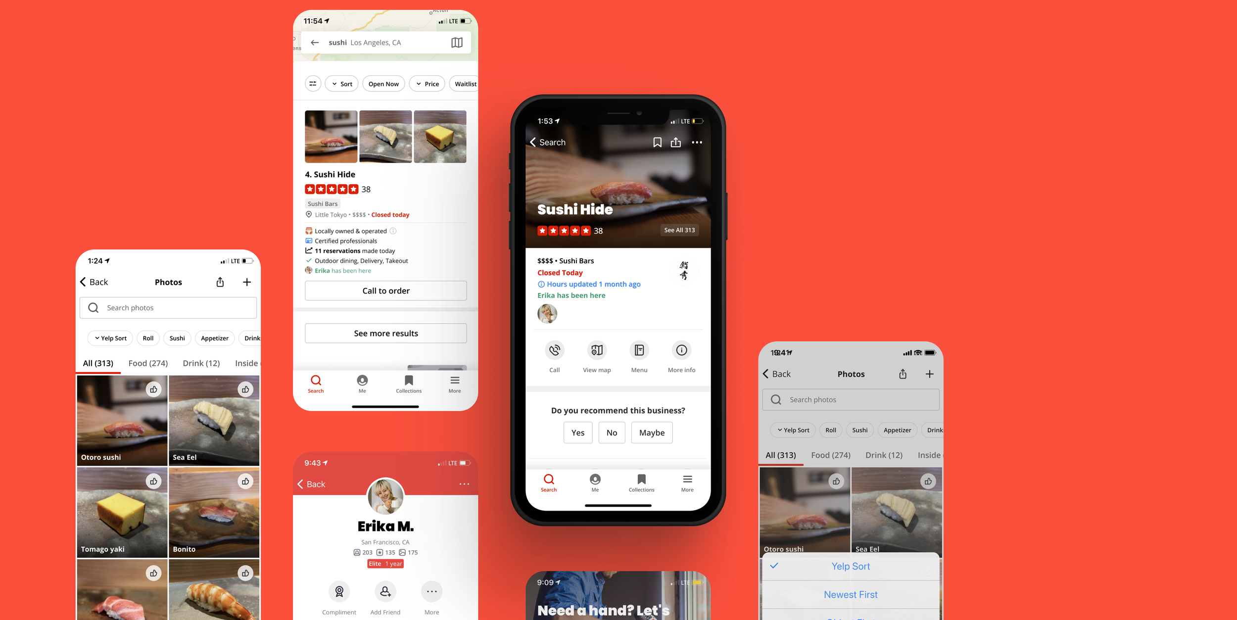
Before — The only way to identify if a friend has been to a business is to browse their past activity or to check the reviews on a business page. Both options require browsing and do not encourage organic discovery.
After — A unified experience that combines business discovery with interaction between connected users.
RESEARCH
Individual interviews identified that my user primarily goes to Yelp to check photos. They often check Yelp before deciding to go to a business and do not write reviews.
I interviewed current Yelp users to uncover insights on how they currently engage with the Yelp app. By organizing interview findings with an empathy map, I was able to identify key insights from common patterns within my observations, which I then reframed as user needs.
Insights
Source for Visuals — Yelp users enjoy looking at photos as a reliable source for gauging a restaurant’s quality. This was the most common shared sentiment among my interviewees.
Readers, not Reviewers — Yelp users do not feel an incentive to write reviews. Users need to feel that their reviews are meaningful in order to feel the need to contribute.
Yelp as Deciding Source — Yelp is a resource for users to confirm if they are interested in a business before committing. Users seek reassurance that they will have a positive experience before going to a business.
Wary of Extreme Views — Yelp users only take reviews seriously when there is a large sample size. Users need reliable reviews that are not just a few extreme opinions.
Based on results from my interviews and market research I created a persona who served as a proxy to the end user.
BRAINSTORMING
My persona’s needs informed the How Might We Questions I developed for brainstorming.
In order to ask the right questions for how the product might best serve the user, I turned to how might we questions based on the user needs I unveiled in my interview findings.
How might we help Hana visualize her restaurant experience?
How might we help Hana feel that her reviews are meaningful so that she feels the need to contribute?
How might we help Hana feel reassured that she will have a positive experience before going to a business?
How might we ensure Hana has reliable reviews that are not just a few extreme opinions?
Guided by my HMW questions, I brainstormed using the mind mapping technique to generate as many solutions as possible. I also wanted to tap into other perspectives, so I facilitated a group brainstorm with four participants. Gathering a group allowed me to generate a large number of ideas in a limited amount of time.
This particular brainstorm followed the brainwriting technique, with the final ten minutes dedicated to voting on and discussing the most popular ideas for each HMW question. It was interesting to see how some votes were unanimous while others split. These moments reminded me of the varying perspectives we hold and the fact that my perspective is just one of the many possible points of view.
One of the struggles I ran into during the group brainstorm was that some users were not completely aware of all the existing Yelp features. As a result, some existing features were mentioned as potential solutions to the HMW questions.
After removing any already existing solutions and accounting for the various pros and cons raised in the group discussion into account, I was left with a few possible solutions.
Friend Tag Feature
Add a feature that visibly shows if a friend has checked into a business, both in the search results and the business's Yelp page.
Photo Sort Feature
Although a photo sort feature strayed from my original intention of designing a feature that increased user-to-user engagement within the Yelp app, I knew that photos were a large part of why users came to Yelp. I decided to build this feature given the low effort required to make a large impact on how many of my interviewed users interacted with the app.
SITEMAP
Building a sitemap of the existing app allowed me to identify the Business Page as the best place to include the friend tag and photo sort features.
With a rough idea of what my feature would look like, I needed to find a home for the feature within the existing user interface. I created a site map while walking through the existing app on my phone. This helped me understand the current app layout and allowed me to determine exactly where the new features would live.
TASK FLOW
As my goal was to incorporate friend activity to the business search process, it was critical that I created a new flow for this feature.
For the friend tag feature, I created a flow where a friend’s past activity is an organic part of the business discovery process. With the existing app, the only way to find the same information is to scroll through friends’ profile feeds. In the existing flow, there is no guarantee that a specific friend has visited a restaurant that fits the desired search criteria.
Finding a local sushi restaurant that a reliable friend has been to before.
The photo sort feature naturally found a place in the photos section of the business page. I checked the user flow for sorting through reviews and applied a similar flow so that users would have a consistent experience across the app.
Sorting photos by date of upload to a business page.
LOW FIDELITY WIREFRAME SKETCHES
When wireframing, focus was placed on following the existing design patterns within the Yelp app to ensure a consistent user experience.
I experimented with multiple iterations of the photo sort and friend tag feature as quick sketches on paper. The sketches below are for the screens that would change according to my task flows.
*Early sketches of the friend tag feature. I focused on keeping the designs simple so as not to interfere with the existing UI.
HIGH FIDELITY WIREFRAMES
Although my new features made minimal changes to the existing app screens, the highly visual nature of the Yelp app made building the screens from the ground up a challenge in itself.
After deciding on layouts from my sketches I moved to Figma and applied the existing branding and new features to create realistic Yelp app screens from the ground up.
It was at this stage that I realized the deeply visual design of the Yelp app. Building the app screens from the ground-up was no easy task for me as a new designer and the process was one with growing pains, however I saw myself getting noticeably faster with each icon design.
USABILITY TESTS
Testing identified that the friend tag feature did not have all the information users required to use the feature intuitively.
Using Zoom, I conducted seven moderated remote usability tests to see if users would be able to use the new features as intended. For these tests, each user was asked to complete tasks using a prototype made up of my high-fidelity screens. The tasks were designed to follow the task flows I had created; finding a business that a friend had been to and sorting photos chronologically.
Users easily completed the task of using the new photo sort feature. The friend tag feature, however, did not see that level of success. All seven of my test participants struggled to identify a business a friend had been to. Users who were able to identify the businesses were not confident that they had found the right visual clues.
After testing, it became clear that in trying to keep my changes to the existing UI at a minimum, I failed to give enough information to the users.

What I learned
TAKEAWAYS
Adding to an existing product comes with a unique set of challenges. Ensuring clarity in my new features while seamlessly integrating with the existing design was a greater challenge than I had anticipated. I found myself overcorrecting and making my design too simple in an effort to avoid cluttering the existing design. Usability tests helped me uncover this weakness in my design.
Pivoting as needed. I started this project with the problem to solve, which I later revisited to encompass the user needs that were uncovered with research. While my initial problem was validated in my research, “How might we help users leverage Yelp’s extensive user base to encourage greater user engagement? Researching allowed me to go deeper into the problem to find the core needs of the user.


